

How to Mix Textures in Living Rooms: A 2026 Styling Guide
Table of Contents
- Start With the 60-30-10 Rule for Texture
- How to Layer Textures in Interior Design
- Hand Woven Textiles for Living Rooms: Where to Place Them
- Mixing Textures in Small vs. Large Living Rooms
- Texture and Tactile Experience: Design You Can Feel
- Budget-Friendly Texture Hacks That Still Look Luxe
- Common Mistakes When Mixing Textures in Living Rooms
- Conclusion
- Frequently Asked Questions
Last Updated: September 23, 2026
Start With the 60-30-10 Rule for Texture
The fastest way to learn how to mix textures in living rooms is to assign every surface a role. The 60-30-10 rule usually applies to color, but it works just as well for texture. Give 60% of the room to one dominant material family, 30% to a contrasting one, and 10% to a third that surprises the eye.
How to Layer Textures in Interior Design
Layering textures in interior design means stacking materials at different heights, weights, and finishes so the eye has somewhere to travel. Start with the largest surfaces, then work inward toward the smallest.
Build From the Floor Up
Floors carry the most visual weight, so they set the tone. A handwoven rug gives you an instant base layer with real depth.
Balance Visual Weight Across the Room
Visual weight is how heavy a material looks, not how heavy it is. A chunky wool rug reads heavy. A sheer curtain reads light.
- Heavy: wool, jute, leather, stone
- Light: linen, cotton, glass, sheer fabric
- Medium: wood, ceramic, woven rattan
Hand Woven Textiles for Living Rooms: Where to Place Them
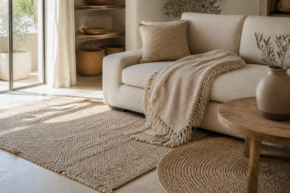
Hand woven textiles for living rooms belong where people actually sit, touch, and relax. That means the sofa, the reading chair, and the floor under both.
Mixing Textures in Small vs. Large Living Rooms
Small rooms and large rooms need opposite strategies, and the reason is visual density, how much surface variation the eye can process before the room reads as busy. A small room has fewer square feet but the same number of sightlines, so each texture gets seen more often. A large room has more sightlines but each one is longer, so textures need to be larger and more varied to register.
Small Rooms (Under 200 sq ft): Fewer, Bolder, Bigger
In a small living room, pick two or three materials and repeat them. Too many textures shrink the space because the eye has nowhere to rest.
- Scale up. A chunky knit throw reads better than three thin ones. A large-scale weave reads better than a small tight weave.
- Repeat, don't rotate. Use the same jute tone on the rug and the basket. Repetition reads as calm.
- Keep one smooth surface. A glass coffee table or a lacquered tray gives the eye a break from all the nubby texture.
- Skip the layered-rug trick. Overlapping rugs work in large rooms; in small ones they chop the floor into pieces.
Medium Rooms (200-400 sq ft): Two Contrasting Families
This is the sweet spot. Choose one dominant family (say, natural fibers) and one contrasting family (say, smooth ceramics and glass). Add a single accent, a leather ottoman, a brass tray, and stop.
Large Rooms (400+ sq ft): Layer by Zone
In a large living room, spread textures across zones. A seating area, a reading nook, and a console can each carry a different mix, and the transitions between zones are where the eye rests.
- Anchor each zone with one heavy texture. A wool rug under the sofa, a jute rug under the reading chair.
- Vary scale between zones. If the seating area uses a tight weave, the reading nook should use a loose, chunky one.
- Use the floor as connective tissue. A single large rug that runs under two zones ties them together without repeating the same texture.
- Add one tall texture. A floor lamp with a paper or linen shade, or a tall dried arrangement, gives the eye a vertical stop.
| Room Size | Texture Strategy | Materials to Favor | Watch Out For |
|---|---|---|---|
| Small (under 200 sq ft) | Fewer, bolder, larger-scale | Jute, linen, one wood tone | Layered rugs, small repeating patterns |
| Medium (200-400 sq ft) | Two contrasting families plus one accent | Wool, cotton, ceramic, one leather or brass piece | Adding a third family 'just because' |
| Large (400+ sq ft) | Layer by zone, vary scale between zones | Wool, jute, leather, stone, glass | Same texture repeated in every zone |
Budget-Friendly Ways to Scale Texture to the Room
You do not need a full redesign to shift how a room reads. A few low-cost moves do most of the work:
- Swap one plain pillow for a textured cover. A single boucle or cable-knit cover changes the sofa's read for the cost of a cover, not a sofa.
- Layer a smaller rug over an existing one, but only in medium or large rooms. In small rooms, replace instead of layer.
- Add a woven basket for blankets or firewood. It adds a rough hand and a vertical shape at once.
- Trade a smooth vase for a ceramic one. Matte glaze reads warmer than glass.
- Hang a natural-fiber wall piece. It adds texture without taking floor space, which matters most in small rooms.
- Thrift or swap textiles. A secondhand wool blanket or a linen curtain panel adds a new hand for very little.
Texture and Tactile Experience: Design You Can Feel
Texture is not just visual. It is the part of a room your hands and feet meet every day, and the part most guides skip. A room can photograph beautifully and still feel cold, flat, or unwelcoming in person. The fix is to design for touch on purpose, not as an afterthought.
Read a Material by Its Hand, Not Its Look
In textiles, the "hand" of a fabric describes how it feels: its weight, drape, surface, and give. Designers use a simple vocabulary that is worth borrowing:
Woven Cotton Blend Throw Blanket with →
- Rough / nubby, jute, sisal, boucle, raw wool. Catches light and shadow; reads casual and grounded.
- Smooth / slick, leather, polished stone, lacquered wood, glass. Reflects light; reads formal and cool.
- Coarse / toothy, linen, hemp, tweed, terry. Slightly dry to the touch; reads natural and relaxed.
- Plush / velvet, velvet, chenille, mohair, shearling. Absorbs light; reads warm and enveloping.
- Crisp / papery, cotton percale, paper shades, woven grass. Holds a crease; reads light and airy.
Match the Hand to the Room's Job
Different rooms ask for different tactile mixes:
- A room for entertaining leans smooth and crisp (leather, glass, linen) so spills wipe up and the space feels crisp.
- A room for lounging leans plush and nubby (boucle, wool, velvet) so it invites you to sink in.
- A room shared with kids or pets needs at least one washable, tight-weave textile (cotton canvas, performance weave) so the tactile layer survives real life.
The Matte-vs-Sheen Rule
Finish is the tactile layer your eye reads even from across the room. Matte surfaces absorb light and look soft; sheen surfaces bounce light and look hard. Pairing one matte textile with one sheen object, a matte linen pillow beside a glazed ceramic lamp, creates depth the eye registers as texture even before your hand confirms it.
Style-Specific Tactile Palettes
This is where most guides stop short. The right tactile mix depends on the style you are building:
- Minimalist, two hands only: one smooth (stone, glass, lacquer) and one soft (wool, linen). Restraint is the texture.
- Maximalist, four or more hands layered deliberately: velvet, jute, brass, ceramic, fur. Density is the texture.
- Modern farmhouse, rough and natural: jute, raw wood, cotton canvas, iron. Avoid high sheen.
- Mid-century modern, smooth and warm: walnut, leather, wool, brass. Keep the palette tight.
- Coastal, crisp and light: linen, rattan, whitewashed wood, glass. Add one nubby textile for grounding.
A Quick Tactile Test
Walk into the room barefoot and sit where you normally sit. Count how many distinct hands you can touch without standing up. Fewer than three means the room needs another layer. More than six usually means it needs editing.
Budget-Friendly Texture Hacks That Still Look Luxe
You do not need a full redesign to add texture. A few small changes can shift how a whole room feels.
- Swap one plain pillow for a textured cover
- Layer a smaller rug over an existing one
- Add a woven basket for blankets
- Trade a smooth vase for a ceramic one
- Hang a natural fiber wall piece
Common Mistakes When Mixing Textures in Living Rooms
Most texture mistakes come from sameness, not excess. When every surface has the same finish, the room goes flat.
Here are the ones I see most:
- Matching every material to the same sheen
- Using only smooth surfaces with no natural fibers
- Ignoring scale, so small patterns sit next to small patterns
- Forgetting the floor as a texture layer
- Buying pieces one at a time with no plan
Conclusion
Mixing textures takes a plan, not a big budget. Start with the 60-30-10 split, build from the floor up, and let each material do one job.
Frequently Asked Questions
How do you balance different textures in a living room?
Balance comes from contrast and distribution. Pair one dominant texture, like a handwoven wool rug, with two or three supporting ones: a smooth cotton-linen throw pillow, a matte ceramic vase, and a soft woven throw. Keep the largest surfaces (rug, sofa) in mid-weight textures, then add one high-contrast accent like a metallic or glass piece. This keeps the room from feeling flat without turning it into a showroom.
What is the rule of thumb for mixing textures in interior design?
Use the 60-30-10 rule adapted for texture: about 60% of the room in one dominant texture family (usually the rug and upholstery), 30% in a contrasting texture (wood, jute, or linen), and 10% in a high-impact accent (metal, glass, or a glossy ceramic). This gives the eye a clear hierarchy and prevents the space from feeling chaotic while still adding depth.
How can I make my living room look more expensive using texture?
Focus on material quality over quantity. A single handwoven rug or a made-to-order piece with visible craftsmanship reads more luxurious than five mass-produced accessories. Layer a natural fiber rug under a wool or cotton one, add a woven throw with fringe, and choose pillows in cotton-linen blends. Mixing matte and subtle sheen finishes, like a matte ceramic lamp with a satin pillow, creates a collected, high-end look.
Should I mix smooth and rough textures in my home decor?
Yes. Smooth and rough textures depend on each other. A rough jute rug makes a smooth leather sofa feel richer, and a sleek glass table makes a chunky knit throw feel cozier. Aim for at least one smooth, one rough, and one medium texture in every seating area. Without that contrast, rooms feel either sterile or heavy, and the eye has nowhere to rest.